7 Key Takeaways from UX STRAT 2018
UX STRAT USA 2018 took place at the Providence Biltmore, in Providence, Rhode Island, on September 16-18, where key members of the UX community gathered to share knowledge and converse on the latest trends in experience design and strategy. Pre-conference workshops took place on September 16; the main conference, September 17 and 18.
7 Key takeaways from UXSTRAT 2018
Think about the entire experience and how to intelligently combine the physical and digital to enhance an experience. Alison Beattie from Target spoke about the “super” app integration that made an in-store shopping experience streamlined. No more juggling between the cartwheel app and the target app. Yihyun Lim from MIT Design Lab shared an emotional IOT example showcasing voice interface, natural language interactions, engaging personality, personalized recommendations, and contextual alerts.
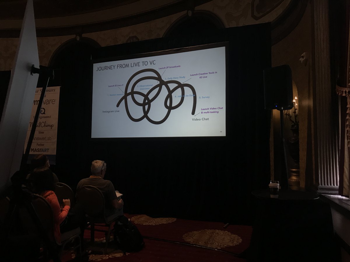
The path forward is continuous learning. Driven by the design process, Meagan McDonald shared how Instagram pivoted from Instagram Live to Video chat. The path was not linear, and through continuous learning via market research, observational interviews, daily diary study, jobs to be done and a survey, 4 iterations were launched with the final being video chat with multi-tasking.
Creating a customer-centric culture doesn’t happen overnight. Heidi Munc from Nationwide Insurance reminded us to take advantage of opportunities to build trust with stakeholders to show the value of UX.
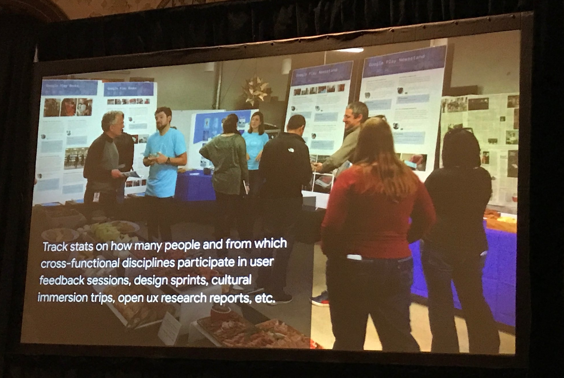
We must show the impact of UX Research to enable growth. Catalina Bock from Google gave a comprehensive presentation about tracking the impact of UX research and how you can create tangibility to advocate for your team, create growth at any level, and change the culture of the organization.
Designers should look for ways to make designers lives better, too. We as designers also need to think about how to improve our workflow and reduce routine challenges for ourselves. Red Dolan shared a case study of how VMware uses design thinking to explore how designers are tackling the challenges of being awash in more tools and demands for collaboration.
Artificial Intelligence (AI): don’t make it the shiny object. Both Astrid Chow and Joe Meersman shared their experience designing with Artificial Intelligence at IBM. With it being the newest shiny object in the room, Astrid and Joe shared are a few key thoughts:
Design with AI not for AI.
When considering AI first determine if the market needs it and if it is the appropriate vehicle. Then, if choosing to design with AI, continue to challenge it along the way.
We must have a code of ethics for AI. To be smarter is to be ethical.
UX might need Rehab. Ronnie Battista shared deep thoughts on how to Turn Off, Tune Out, Drop In. Our attention is constantly divided. Sometimes it’s good to disconnect in order to connect better.


